Color may be employed as a powerful technique in art because of its hidden meaning, and the artist can utilize color to charm the audience once the basic principles have been grasped. According to research, the hidden meaning of color might significantly impact our overall well-being.
The color we surround ourselves with has an effect on our sense of well-being. Besides, color allows us to express ourselves in art and design by being unique. As a result, color has been used to enrich our settings for years by interior designers, graphic designers, advertisers, and artists.
Also, as a business owner or designer, it’s critical to understand these color meanings to make wise color choices and tap into the mystical power of color symbolism.
Several factors, including psychology, biology, and cultural evolution, have played a part in shaping what each color means. Strong associations to certain colors like red being a color of fire and linked with warmth or green being associated with nature are prevalent since they are all around us.
It’s not always been this way, but over time connotations and, color associations have changed. Pink used to be only a women’s color in the Western world; now, you find pink stores & other items meant for girls. The same goes for blue – it used to mean something different. Society has come to adopt these meanings as their own, and they’ve evolved into.
What’s Color in Art?
Color is the experience that a human perceives when light waves strike an item and reflect the optic nerve in their eyes. This means although color can be measured scientifically, it is also completely subjective.
Color is used by artists, particularly painters, to depict mood, light, depth, and point of view in a work of art. Color theory, a set of criteria for mixing, combining, and modifying the color spectrum, has undergone several variations throughout history.
Before diving into what each color could mean, let’s briefly discuss primary and secondary colors; Blue, yellow, and Red are considered the primary colors. Secondary colors are the ones you get mixing any two of the primary colors.
For example, mixing yellow and red gives you the color orange. You will have tertiary colors upon mixing one primary and one secondary color. To darken any color, you can add a little black to it. To get a lighter shade, you can add some white to it. Now let’s move on to the meanings of those colors;
Red
Red is regarded as the color of impulse, romance, ambition, vitality, excitement, strength, assertiveness, and power. It’s a skin-flattering color that also works as an excellent background.
Lighter shades of red, such as pale pinks, are soothing and comforting, and they go well with greens. The darker reds evoke a sense of restrained luxury and force or passion.
Red also evokes a straightforward personality with love for life. Red, on the other hand, might indicate danger or threats. A good example is fire engines, stop signs, and traffic lights.
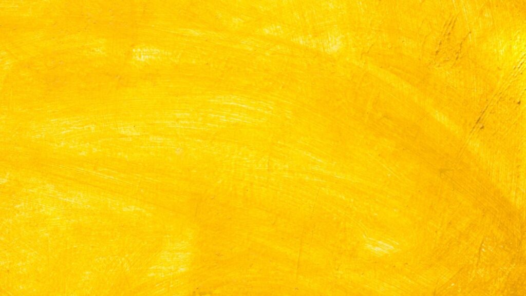
Yellow
The color yellow is frequently linked to the sun, representing light. This color evokes feelings of optimism and happiness, as well as knowledge. It instills in you a sense of hope, happiness, and natural light.
Yellow is radiant, airy, and atmospheric. It is a vibrant color, but it also conveys that everything is okay, which might be calming. However, not all shades of yellow are created equal.
While light Yellow is associated with intelligence, freshness, and joy, dull Yellow is linked to caution, decay, disease, and jealousy. Certain shades of yellow might make you think of caution tape or radiation symbols.
In America, during the pioneer days, yellow dogs became synonymous with something worthless. Additionally, the usage of yellow-coloured paper in old books and the yellowing of tree leaves when they start to age and decay led to the association of yellow with sickness.
On the other hand, Yellow is quite good at catching attention. Think of a taxi cab or yellow signs put out for spills. If you plan to use yellow in your art, think about what you are trying to portray.
You could end up expressing danger where there is meant to be fun or joy where there is meant to be sadness. This duality could also be a beautiful basis for a piece with deep meaning.
Orange
The color orange is a mix of yellow and red. It’s flashy, vibrant, and energetic and thus used in many company logos. It is associated with youth and the qualities of being bold, spontaneous, lively, and assertive.
Orange could both stimulates the brain and encourage mental activity. Dark orange is associated with deception and suspicion, but an orange closer to red is associated with aggression, dominance, and a desire to act.
Blue
The sky and its reflections on water surfaces are both blue. As a result, this color is frequently utilized to convey a sense of expansiveness akin to the skies and oceans.
Blue may often be associated with being a masculine color, but it’s also connected with a calm, soothing, and caring attitude. This makes it a good choice for a wise and steady character.
Blue is also very frequently associated with gloomy feelings. There is even an expression known as “feeling blue,” which means that you are feeling down or sad.
Blue is also one of the few universally liked colors. This makes it a great color for both boys and girls. For instance, a blue suit can look great and give off a vibe of relaxation, therapy, or meditation because of its relationship with calm and tranquility.
Green
Green is a color that is associated with nature. It represents the color of grass and trees, as well as springtime and rebirth. Another connection to green is “getting the green light,” which means someone has given approval to proceed or have a plan succeed.

Dark green can also be seen as a sign of wealth, stability and growth. Green is also frequently viewed as a fourth color above the major colors of red, yellow, and blue, providing visual balance and, as a result, a pleasant and relaxing effect.
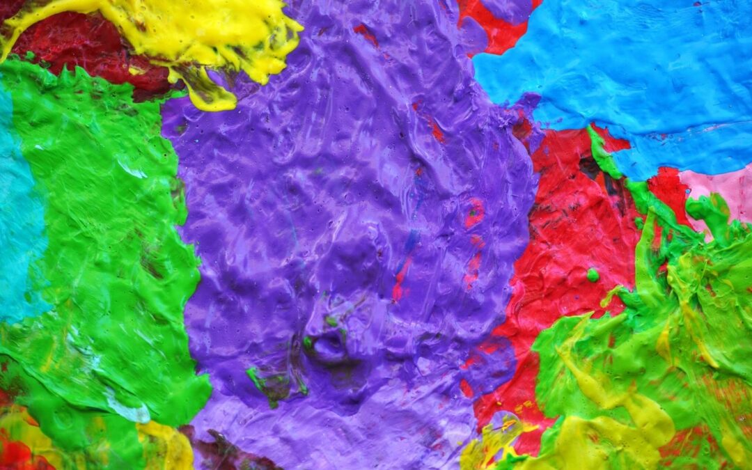
Purple
Purple is an intriguing hue because it is warm and cold, combining red’s passion and fire with blue’s tranquility and serenity. Purple dye was historically expensive; therefore, wealthy kings could only afford it.
Purple was worn by the governing classes and kings and queens of old; for example, Queen Elizabeth I barred anybody outside the royal family from wearing it.
Purple is also linked to religion and spirituality, as ancient monarchs were supposed to be descended from gods. Even today, color has special significance in religion around the world.
Pink
Pink evokes images of tiny girls, cotton candy, and vividly colored bubble gum. Pink is associated with femininity, romance, sensitivity, and gentleness. It has a natural sweetness, cuteness, and charm to it.
Classically, pink is an easy way to say “this is for ladies,” and it’s a wonderful choice if you know it’ll appeal to your female target market. However, more recently, it may be off-putting to some audiences. Many people are beginning to oppose assigning colors to specific groups of people based on stereotypes.
You can also utilize pink in unexpected ways to differentiate yourself from your boring and drab competitors or add a startling aspect to an otherwise smart design. The trick with all colors is to use them in ways that aren’t overdone but make a big impact.
Brown
Brown is regarded as a natural color linked with the earth, thus providing feelings of stability and support. Due to its association with the land and environment, brown evokes images of agriculture, farming, and other outdoor activities.

Brown is welcoming and kind, practical and dependable, and it can also hint at the traditional and well-established. Browns also tend to exude warmth and wholesomeness due to their warm and neutral properties.
To fully achieve that organic sense, use it for an earthy brand and naturally paring with green. Also, use brown to create a long history and a sense of tradition. Lastly, brown is a good color for chocolate brands for obvious reasons.
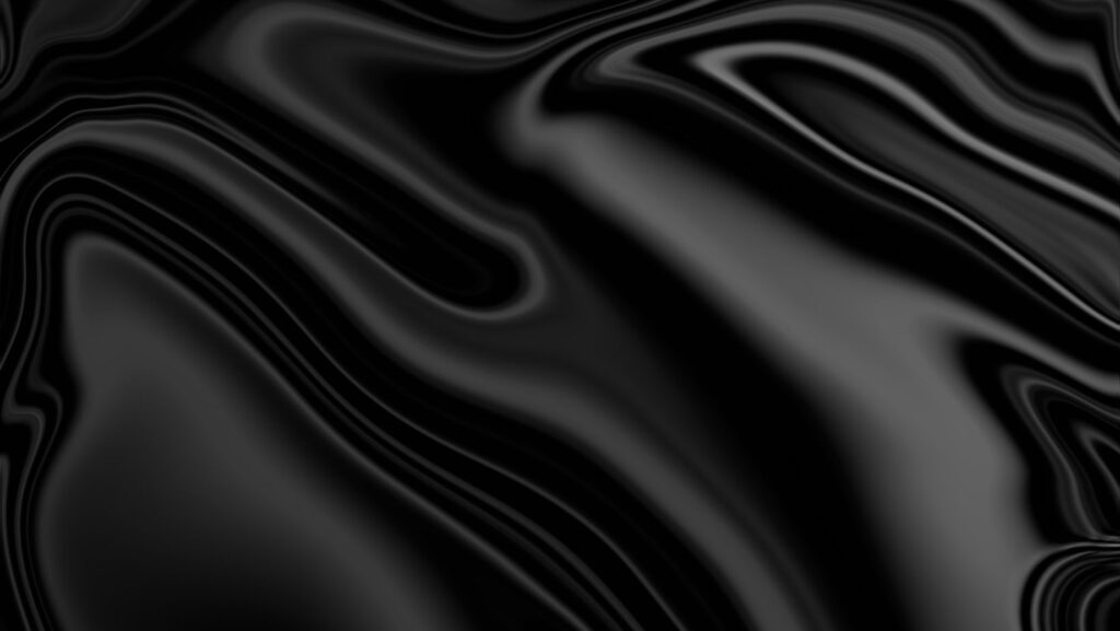
Black
Black is one of the most flexible colors in graphic design, and it’s also the most popular. Black is often associated with exclusivity, power, and elegance in branding and marketing.
Black is bold, forceful, and a little enigmatic, making it a popular choice among contemporary brands. Depending on the design environment, you can use black to create a cool, inaccessible look. At the same time, it’s a naturally neutral color that blends nicely with any other hue.
You’ll see black everywhere you go, from packaging at grocery stores to the playing cards at Springbok casino coupon. It truly is a universal color that goes with anything.
White
From science, you know that white light comprises all the colors of the rainbow. Although to the naked eye, white is the absence of any color. It’s commonly connected with purity in Western cultures, but in some Eastern cultures, it can denote sorrow.
White has a minimalist style when utilized in design and branding since it can be quite basic, clean, and contemporary. Also, it’s the most neutral of all the colors, and it may be rather unremarkable when used as a base for other, more vibrant hues.
Apple’s advertising and packaging are a striking example of how white can create a modern, minimalist style that emphasizes the wonderful product design. Additionally, like all the other creative components, white space can be crucial in a design.
White is also a popular choice for website backdrops since it makes it easier to read your information. Commonly, it is utilized in color schemes as a supplementary accent. Lastly, it may conjure up images of spring and femininity when paired with pastels; when paired with simple black, it becomes timeless and minimalistic.
Gray
Gray is a more mature, responsible color linked with old age gray hair. It has positive meanings such as formality and dependability, but it can also have negative implications such as being extremely traditional, conventional, and emotionless.
Gray is calm, quiet, safe, and muted. If you have a serious brand and want to convey the authority and stability of a business institution, gray is the color to use. Besides, combine it with blue for the ultimate combo to relay reliability and tradition.
It’s a highly popular site design hue. Gray can be used as a substitute for white for a softer website background—or as a substitute for black text for a less harsh contrast and easier reading.
Conclusion
So there you have it, a fantastic tour through colors and feelings. Of course, this isn’t a precise science. People may have personal preferences that take precedence over deeper biological tendencies. Cultures interpret things differently, and possibly even a person’s mood that day.
Now that you’re familiar with the rules, you can experiment with them to determine what works best for you. You’re free to break them as well. Just make sure you’re doing it on purpose and not just picking odd color combinations without thinking about how they’ll look.
Now that you are well informed about color, I hope you can use it to add the right motif or theme to your paintings to capture the emotion you want to convey. Therefore, the most critical point about color is what it conveys to the viewer.
At the end of the day, though, you are the artist. Listen to what your artist’s mind is telling you. Most people don’t need to be told how something makes them feel. It’s all about what you like, and you should only choose colors that you like to create the feel you want.